During the last decade climate change and sustainability have finally become a core issue for most major organisations around the world, from governments and NGOs to brands and retailers. But in an age of disinformation, global warming denial, greenwashing and consumer scepticism, two of the biggest challenges organisations face is how they illustrate the enormity and importance of the challenge ahead, and how they quantify the impact or relative success of the measures they are taking.
Two recent initiatives, one from a company on the bleeding edge of sustainable innovation and the other a professional sports team, illustrate the power of data visualisation to educate communities and give them digestible, understandable and actionable insights about climate change.
Fuelling informed conversations
Late last month English professional soccer team Reading FC announced that its home kit for the 2022/23 Championship and Women’s Super League seasons would include “climate stripes” alongside its usual blue and white hoops. Each stripe on the kit’s sleeves and shorts denotes whether the average global temperature during each year of the club’s one and a half century history was above (red) or below (blue) the expected temperature. The darker the colour, the more extreme the difference from the norm, and thus the sleeves, which will be seen by hundreds of thousands if not millions of fans during the season, clearly illustrate that we are in a prolonged period of extreme temperature rise.


The climate stripes concept was created by Professor Ed Hawkins, a climate scientist at the University of Reading, who says they “are intended to start conversations about climate change” and adds that “making them visible to thousands of football fans across the country every week brings that to a new audience.”

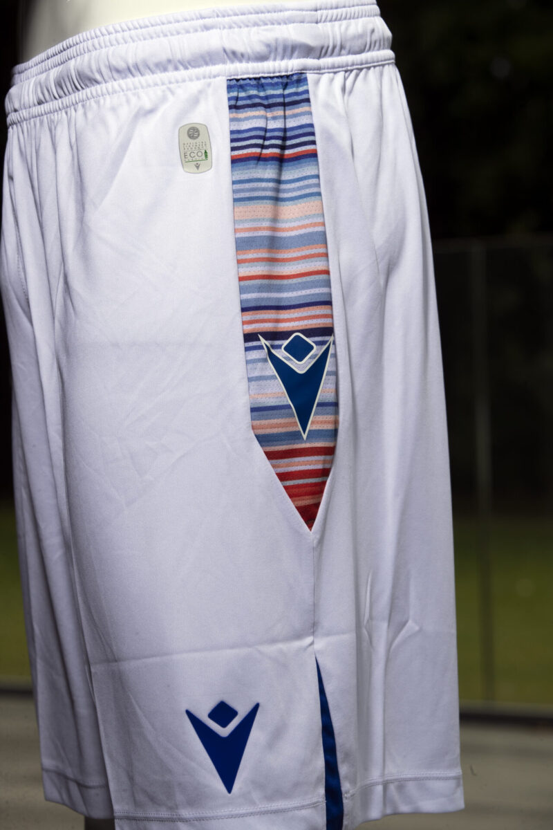
The use of the climate stripes is part of the club’s wider sustainability-focused partnership with the University of Reading, and their ability to tell a complicated story in a simple, accessible way means their data visualisation approach is also being embraced by other industries. Having previously featured at London Fashion Week and on the Main Stage at Reading Festival, they are also the core design property on the cover of Great Thunberg’s new book, The Climate Book, due to be released in October.
Visualising progress (or lack of it)
Meanwhile in Sweden, sustainability-focused company Doconomy has partnered with climate data specialists Kayrros on a scheme that aims to “promote climate literacy and empower consumers to shape their climate future.”
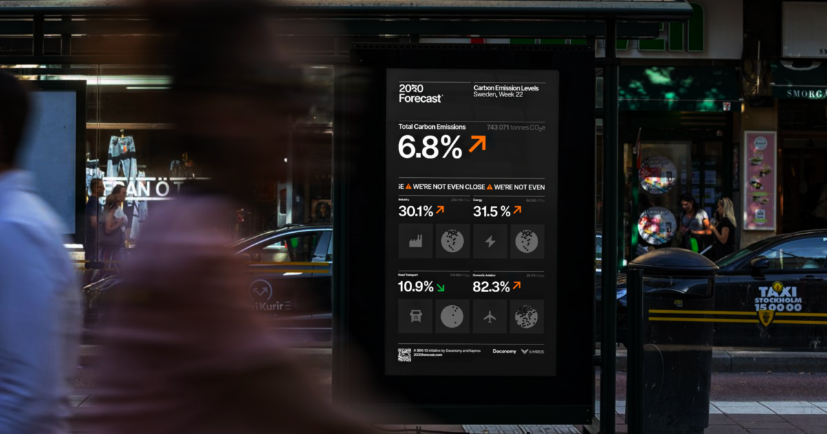
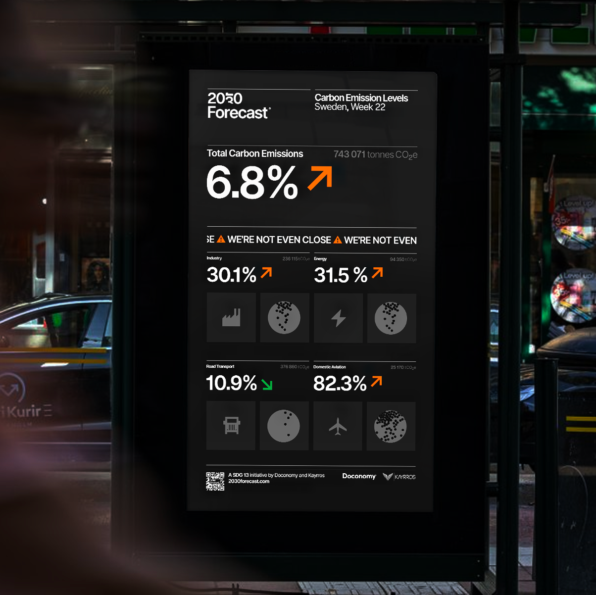
As part of the companies’ 2030 Forecast campaign, real-time billboards have been set up in Stockholm that livestream data tracking whether Sweden is on course to meet its 2030 emissions reduction goals. The dashboard shows a snapshot of the country’s carbon footprint from the previous week including the tonnes of CO2 emitted and how much this amount is over or under the trajectory needed to hit the 2030 target. It also shows the emissions breakdown for key areas such as industry, energy, road transport and aviation.
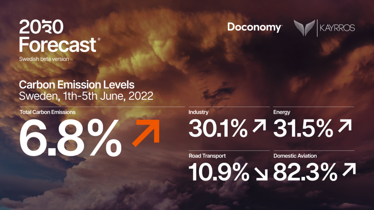
Johan Pihl, chief innovation officer at Doconomy, believes the initiative not only brings to life hard to access information, but also creates a link between individual consumer’s consumption habits and the bigger picture. “The public deserves to be aware of our actual progress in achieving the emissions reduction goals. It’s the first step in taking action and making the connection between an individual’s carbon footprint and the environmental impact of industrial emissions. At first, the national emissions numbers might be difficult to put into direct context, but we are confident they will become familiar and relevant over time, it is the beginning of a learning curve long overdue”.
Accountability over greenwashing
The 2030 Forecast is also available to view on Doconomy’s website, where visitors can also track how the UK is performing against its emissions reduction targets. (Spoiler alert, it doesn’t make good reading for the UK!).
Initiatives like the 2030 Forecast show how brands can use data visualisation to prove that their climate pledges aren’t just platitudes or empty promises, but that they are following up with actions that are driving genuine change. With 2025, 2030 and 2040 being set as key milestones in many brands’ sustainability and regenerative thinking reboots, it’ll be interesting to see which companies in the coming years use this approach to show that they’re walking the walk, and not just talking the talk.
If you’re interested in any of the themes discussed in this article, get in touch with rachel@gdruk.com to find out how GDR’s consultancy, inspirational speaking, trends and sector reports can help drive positive change in your business.